Rebranding and logo design strategy became essential for HDA Real Estate, a prominent Egyptian company specializing in commercial and residential properties, as it recognized the need to overcome several challenges. The company’s previous branding lacked the modern appeal necessary to attract new clients and investors, making it outdated and ineffective in the competitive market. This rebranding and logo design strategy aims to revitalize HDA’s image, aligning it with current market trends and enhancing its appeal to a broader audience.
The Brand Challenges
- Lack of brand recognition: HDA’s previous branding was not easily recognizable, making it difficult for potential clients to remember the company.
- Outdated visual identity: The old design became outdated and failed to align with current market trends.
- Weak brand messaging: The company’s messaging was not clear or compelling, making it difficult to differentiate HDA from competitors.
HDA’s Rebranding Solution
To address these challenges, HDA embarked on a comprehensive rebranding initiative aimed at creating a modern, memorable, and visually appealing brand identity that would resonate with its target audience.
Key elements of the rebranding solution included:
Logo redesign:
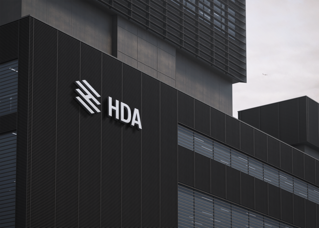
- The team created a new logo that is visually striking and easily recognizable. As a result, this design not only enhances brand visibility but also strengthens recognition. Moreover, it improves the overall brand presence, which, in turn, leads to greater consumer trust and loyalty. Consequently, the new logo plays a crucial role in reinforcing the brand’s identity and distinguishing it in the marketplace. Therefore, this strategic change is essential for the brand’s success and long-term growth.

Logo Concept:
The logo design for HDA Real Estate is a creative interpretation of the brand name. The design cleverly crafts the initial letter ‘H’ to symbolize a multi-layered building, incorporating ladder and brick wall elements—strong visual metaphors for the real estate industry.
This unique design fosters a strong brand identity, making it easily recognizable and memorable.

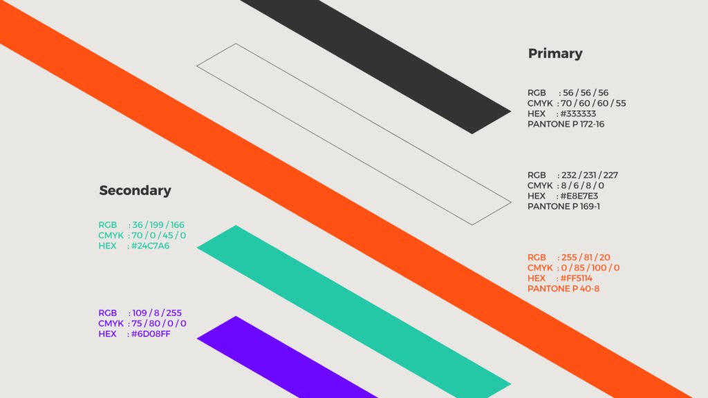
Color palette update:
The team chose a fresh color palette to give the brand a modern and contemporary feel.

The team developed clear and compelling messaging to highlight HDA’s unique qualities
value proposition.

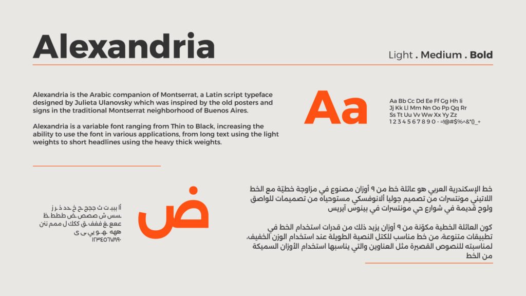
The logo’s typography:
The typography chosen for HDA Real Estate complements the logo’s geometric design.
Moreover, the team selected a simple, bilingual font.
This decision ensures readability and consistency across both Arabic and English applications.
In addition, it reflects the brand’s commitment to accessibility.
As a result, the font enhances user engagement and strengthens recognition.
Consequently, it helps the brand connect with a wider, more diverse audience.

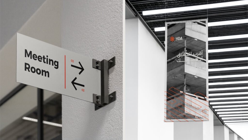
Consistent branding across all channels: The team ensured consistent branding across all channels by implementing the new brand identity across all marketing materials.


The Results of rebranding HDA
The rebranding initiative was a resounding success for HDA Real Estate. The company experienced a significant increase in brand recognition, customer loyalty, and sales. The new brand identity helped HDA to stand out from its competitors and attract a wider range of clients.

Lessons Learned from HDA rebranding case study
HDA’s rebranding success story offers valuable lessons for other businesses looking to improve their brand:
Identify your brand’s challenges: Conduct a thorough assessment of your current brand to identify areas for improvement.
Develop a clear brand strategy: Define your brand’s purpose, values, and target audience.
Create a memorable brand identity: Invest in a visually appealing and memorable brand identity.
Ensure consistency: Implement your brand consistently across all marketing channels.
These steps help businesses overcome branding challenges. They lead to long-term success.
