In the fast-evolving world of business in Saudi Arabia and Egypt, the visual gap between “dated” and “dynamic” is widening. As we move further into 2025, the most successful brands are ditching complex ornamentation for clarity. At Qsandr Creative Studio, we believe that a minimalist corporate brand identity is not just an aesthetic choice—it is a strategic business asset.
This case study breaks down our recent work for Brandev, a pioneering business solutions provider in KSA, demonstrating how we used trending design principles like Swiss Style and abstract symbolism to build a brand built for speed and trust.
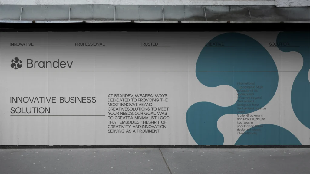
The Challenge: Visualizing “Business Solutions” Without the Clutter
Brandev is a forward-thinking company launching in Saudi Arabia with a clear mission: to provide innovative business solutions that drive swift, substantial growth. They needed a brand persona that balanced two opposing forces:
- Innovation: The ability to provide avant-garde, creative solutions.
- Formal Trust: The sagacity and expertise of seasoned professionals.
The challenge for Qsandr was to create a visual system that felt “trustworthy” without being boring, and “creative” without being chaotic.
The Concept: Abstract Minimalism Meets Innovation
Leading branding trends for 2025 emphasize “Bold Minimalism”—designs with fewer elements but a heavier impact. For Brandev, we avoided literal icons (like gears or handshakes) and opted for a purely abstract approach.
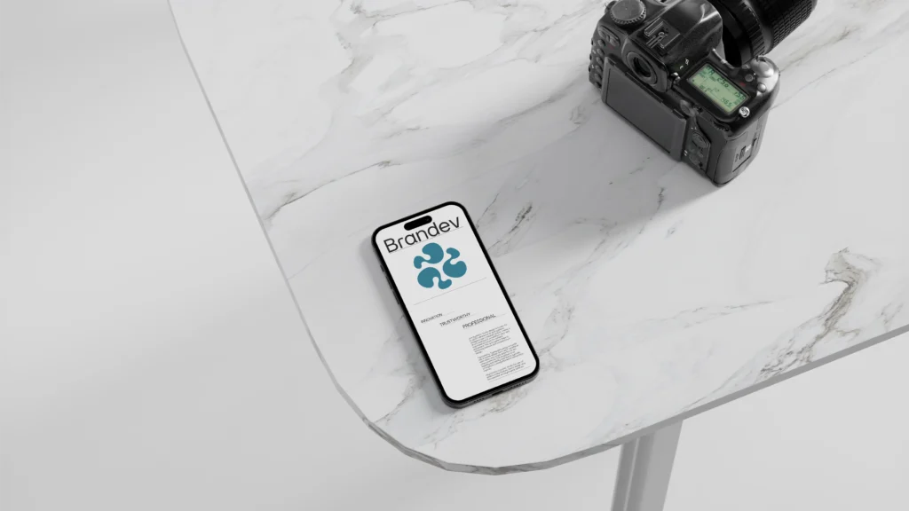
The Logo Design
Our goal was to craft a minimalist emblem that serves as a visual metaphor for the “synergy of creative prowess and business acumen”.
- Shape: The logo features a fluid, triangular interaction of shapes. It evokes motion and evolution, aligning with Brandev’s promise to help clients “evolve and thrive within a compressed timeframe”.
- Negative Space: By utilizing smart negative space, the mark feels open and dynamic, rather than heavy or static.
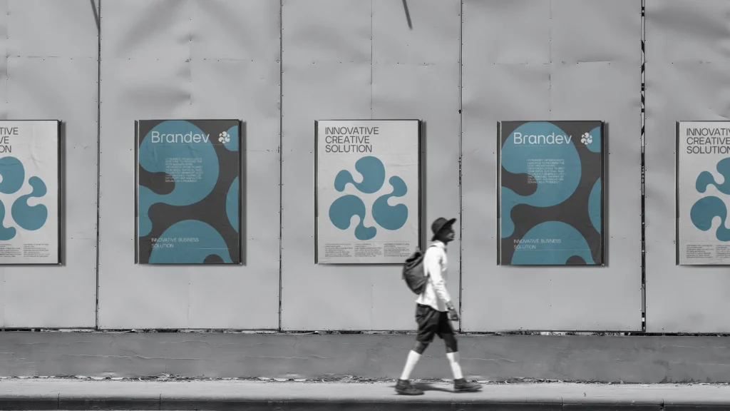
The Design System: Why Swiss Style Rules Corporate Identity
To ensure the brand could scale across everything from business cards to billboards, we adopted the Swiss Style (International Typographic Style). This design philosophy is trending heavily in corporate sectors because it prioritizes legibility and objectivity.
1. The Grid System
We utilized a modular grid to create structured, organized layouts. This ensures that every proposal, invoice, or PPT presentation Brandev sends out looks mathematically balanced and professional.
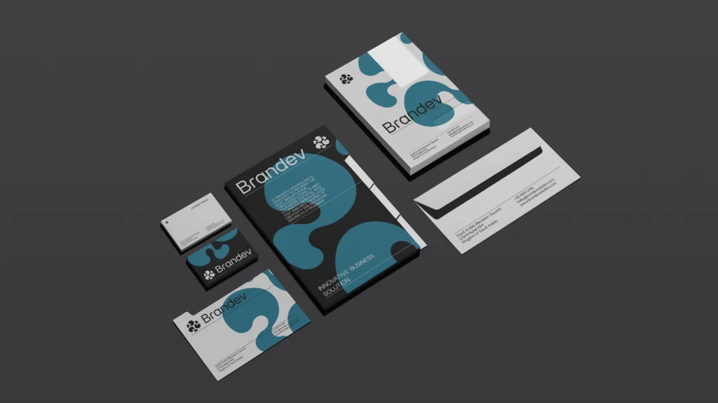
2. Typography
In 2025, typography is the hero of brand identity. We selected fonts that exude modern professionalism:
- English: Argon – A clean, geometric typeface that enhances readability.
- Arabic: Swissra – A modern font that complements the Swiss design ethos while maintaining cultural relevance.
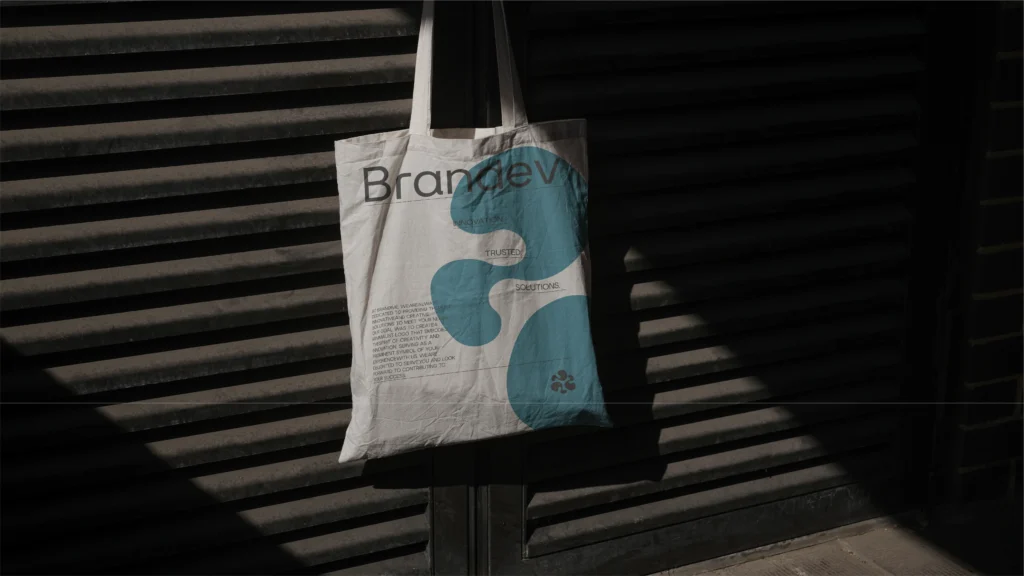
3. Color Palette
We moved away from loud, shouting colors. Instead, we selected a “Quiet Luxury” palette that conveys authority:
- Primary: Mine Shaft (https://www.google.com/search?q=%23282828) and Black (https://www.google.com/search?q=%23000000) for deep, formal grounding.
- Secondary: Teal Blue (https://www.google.com/search?q=%23377090) to introduce a calm, trustworthy accent without overwhelming the eye.
The Result: A Brand Persona That Speaks Volumes
The final output is a brand identity that feels Formal, Trustworthy, and Dynamic. Whether it’s a digital template or a printed rollup, the Brandev identity communicates that they are “partners” in sustainable growth.
At Qsandr Creative Studio, we don’t just design logos; we build systems that help your business sell better working hours and build long-term relationships.